
The World’s Best-Performing Stock Markets in H1 2026 Weren’t Where You Were Looking
From Knowledge to Action: what six months of global market data actually shows, and why “the market” is bigger than the one on your phone’s home screen.
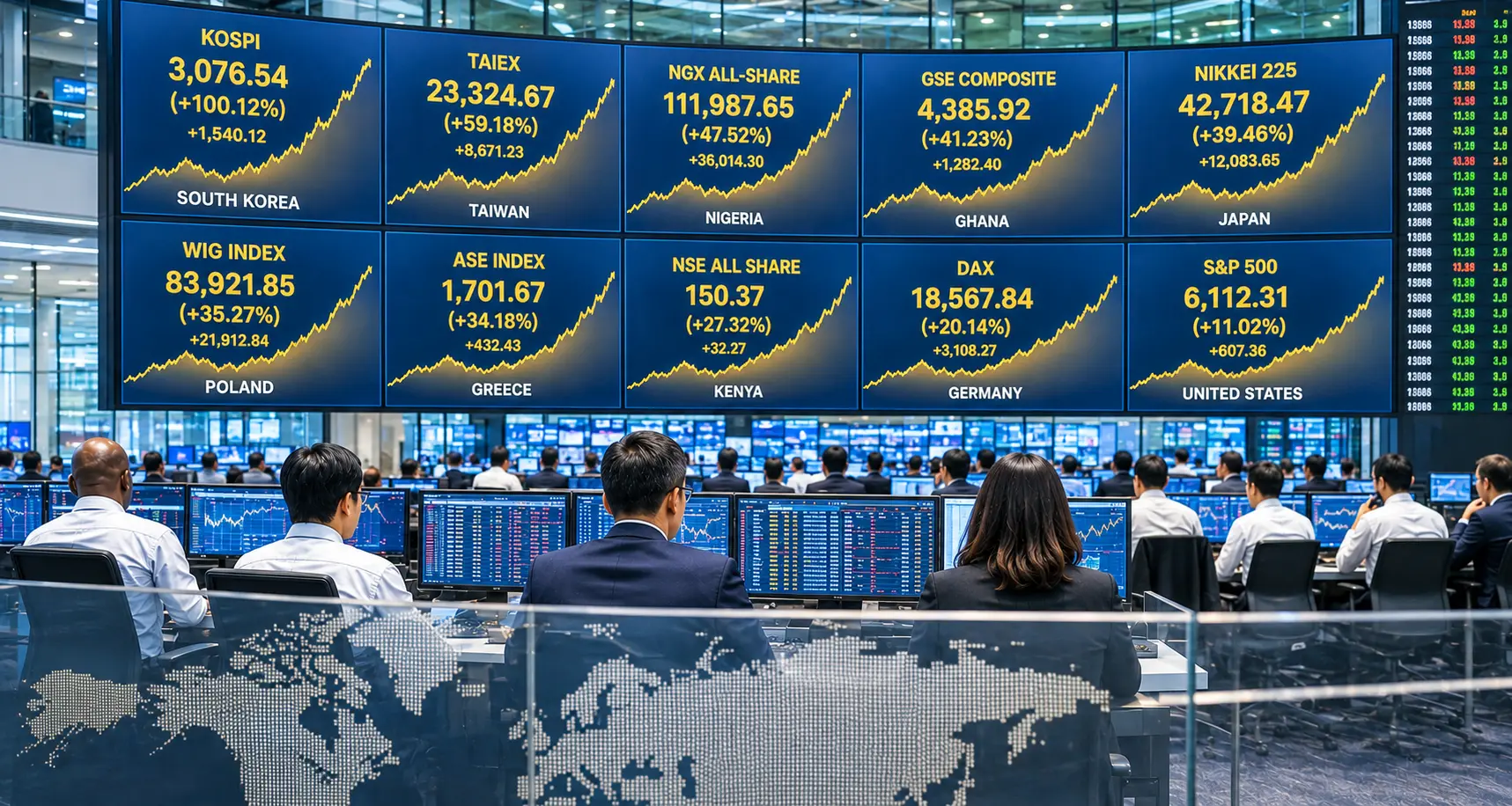
If your idea of “the stock market” is the S&P 500 or the ASX 200, the first half of 2026 would have quietly humbled you. While US headlines focused on tariffs, AI capex and a volatile Federal Reserve, South Korea’s benchmark index effectively doubled in six months. Nigeria’s exchange outpaced Wall Street. A handful of markets most people couldn’t name delivered some of the strongest returns anywhere in the world.
This matters right now because it’s a live reminder that market performance in any given period is rarely concentrated where the headlines are pointing. Investors who only track one or two familiar indices are, by definition, watching a small slice of what’s actually happening with global capital.
By the end of this article, you’ll know which indices led the world in the first half of 2026, what was driving them, and what typically happens after a rally this sharp.
Why You Should Care
Ignoring markets outside your home country doesn’t make them irrelevant, it just means you find out about them after the fact. Global diversification is one of the more well-documented ideas in investing research, and periods like this one are a clear illustration of why: the “safe, familiar” market and the “best-performing” market are frequently two different things.
Top 10 global index returns, January to June 2026
Approximate price-return percentage, January 1 to June 30, 2026 (local currency)
Figures are approximate price returns (excluding dividends) reported by financial media and exchange data as at late June / early July 2026. Different sources measure slightly different date windows, so treat these as directional rather than precise to the decimal.
What Was Actually Driving This
The AI and semiconductor cycle lifted Asian markets hardest. South Korea’s KOSPI and Taiwan’s TAIEX were the two standout global performers, and both are heavily weighted toward chipmakers. Samsung Electronics, SK Hynix and TSMC all benefited from surging global demand for AI server hardware and memory chips. Japan’s Nikkei 225 rode a similar tech wave, compounded by a weaker yen. The RBA’s chart pack is a useful free reference for tracking how global growth and trade themes like this flow through to broader markets. A pattern many market-watchers note during a semiconductor-led rally is checking which specific companies are actually driving an index’s headline number, rather than assuming the gain is broad-based.
Frontier and smaller markets had an unusually strong half. Nigeria, Ghana and Kenya all posted returns ahead of the Nasdaq, FTSE 100 and Shanghai Composite, something that rarely makes global headlines. Nigeria’s rally was concentrated in oil and gas and banking stocks, supported by sector reform and strong earnings. The IMF’s World Economic Outlook is a reputable free source for the macro backdrop behind moves like this in emerging and frontier economies. A habit some longer-term investors report is looking at these markets as one data point in a global picture, rather than as a market to chase after the fact.
Headline gains and volatility travelled together. Nigeria’s index peaked at roughly 60% year-to-date in late May before a sharp June correction brought it back to around 47%. South Korea’s KOSPI, while still up sharply, also endured a wave of volatility late in the half. ASIC’s MoneySmart has a plain-English explainer on investing and risk that’s relevant regardless of which market you’re looking at. Many market commentators point out that a six-month return figure, taken alone, tells you nothing about how bumpy the path to get there actually was.
What People Commonly Do When a Rally Like This Makes Headlines
-
1
A common response to headline-grabbing rallies is checking a fund or index fact sheet to see exactly which countries and sectors are already represented in an existing portfolio, something that can be done free in a few minutes with most platforms’ holdings breakdowns.
-
2
Many investors compare price return (the index number in headlines) against total return, which includes reinvested dividends, before drawing conclusions about how strong a market’s performance actually was.
-
3
A frequent observation in behavioural finance research is that people tend to notice a market’s rise only after most of the gain has already happened, which is why some investors treat “best performer of last half” as a data point rather than a signal.
-
4
Some people use free tools such as ASIC’s MoneySmart compound interest calculator to model how different growth rates and time horizons play out, rather than relying on a single six-month figure.
-
5
A common habit is keeping a short watchlist of two or three international indices alongside domestic ones, simply to build familiarity with how global markets move relative to each other over time.
The Bottom Line
The core insight from H1 2026 is simple: the markets making the most noise in the news are rarely the same ones producing the strongest numbers. Missing that isn’t costly in a dramatic way, it just means decisions get made with a narrower picture than the one that actually exists.
None of this means chasing last half’s winner. It means knowing that “the market” is a much bigger and more varied place than the handful of indices most people default to watching.
Build the habit of seeing the full picture
If you want to build habits like tracking global markets, understanding what’s actually in your portfolio, and thinking in decades instead of headlines, alongside others working through the same journey, MSH is a free community built around exactly that.
Join free here